Qualitätsatlas Pflege
A first-time effort to measure and visualize the quality of care in German nursing homes for policy makers.
00

Role
This project was designed and launched during my time at Studio NAND. As the lead UX/UI designer I was responsible for user research, shaping the overall information architecture and interaction design. A key part of my role was translating the client’s scientific goals into clear data narratives — aligning what the end-users should take away from each dataset, with what was technically and visually feasible. I developed the explanatory texts, translating complex public health data into accessible, decision-enabling information. I led cross-team communication and project prioritization, aligning the client and engineers around shared product goals.
Challenge
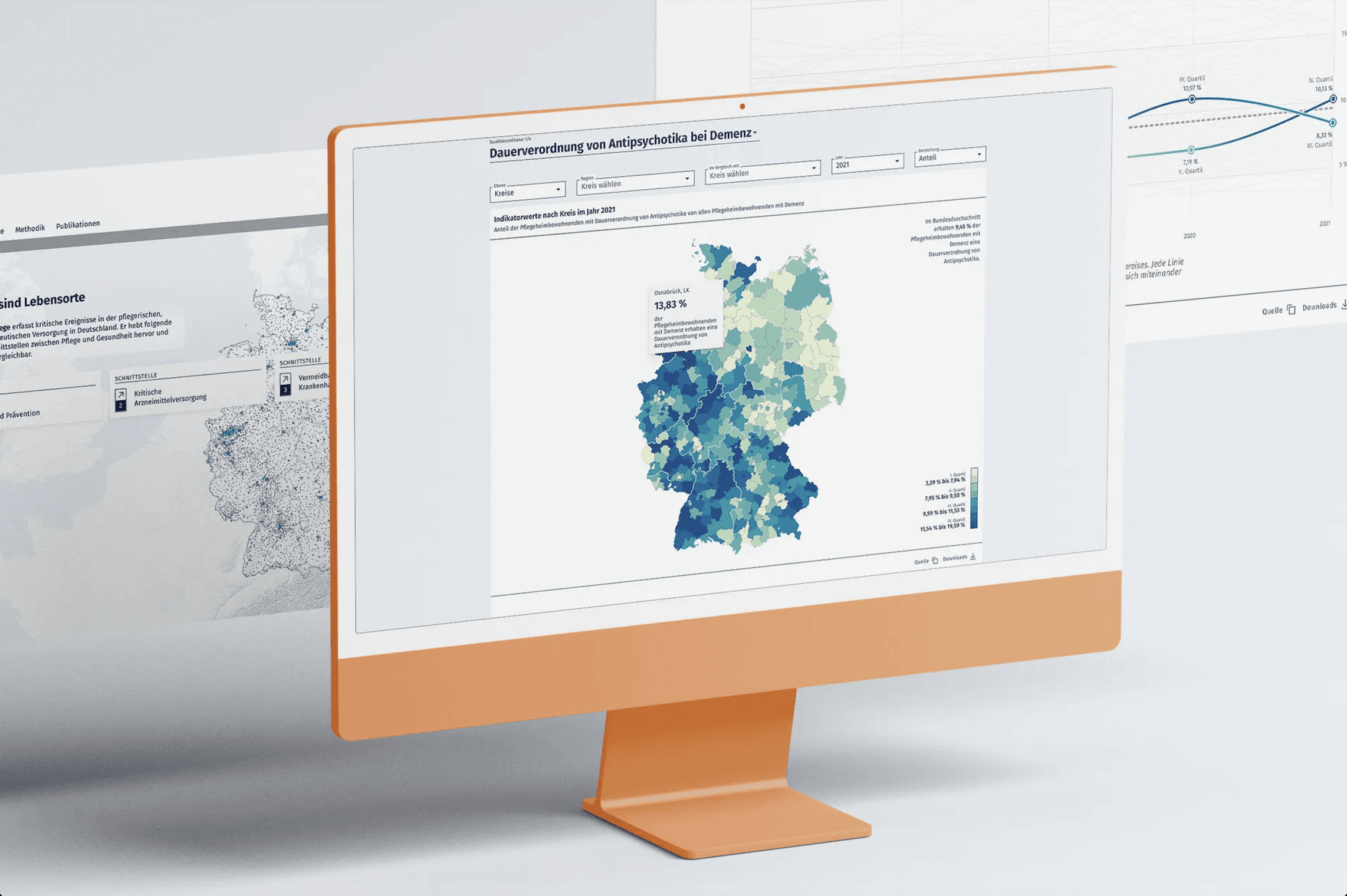
The key challenge was making health insurance data accessible and actionable for policymakers and journalists. To achieve that, we had to transform five years of data from 370.000 nursing home residents across 401 districts in Germany into usable visualizations. The goal was balancing scientific accuracy with usability — providing enough context for understanding without oversimplifying complex insights.
qualitaetsatlas-pflege.de
Process
Over nearly four months, we collaborated closely with the client through weekly working sessions throughout the project — shaping the data and refining its presentation through interactive data visualisations. Using shared Miro boards, I developed and iterated on wireframes, user flows, and content structures to review data logic, experience goals, and explanatory texts together with the client and our data expert. This ongoing feedback loop ensured alignment between scientific accuracy, user needs, and design decisions.
Solutions
From a UX perspective, the primary goal was to make complex information clear, accessible, and useful—both for quick insights and in-depth analysis. Together with the client, we defined key requirements for the solution:
Enable users to explore the data at their own pace
Offer multiple data visualizations to support both high-level overviews and detailed investigations based on individual interests
The final product delivered a flexible, user-centered data exploration experience:
Intuitive navigation across 10 quality indicators
A robust filter system for regional and time-based analysis
An interactive map for spatial exploration
8 different visualization types tailored to diverse analytical needs
Data export options as images and structured tables
A fully optimized mobile experience
01

02

03

see also

