Infektionsradar

Transforming Healthcare Communication: Making complex infection data understandable at a glance.

00

Role

This project was designed and launched during my time at Studio NAND in collaboration with Cosmonauts & Kings. I co-led usability testing and insight synthesis to produce multiple design iterations on wireframe-level, with a strong focus on improving navigation systems and the comprehensibility of the data visualisations. In parallel, I developed the explanatory texts, translating complex public health data into accessible, decision-enabling information for the general public.

Challenge

The main challenge was to design a user-friendly dashboard that translates a large amount of complex public health data into clear, accessible insights for the general public. Insights from the previous version of the Infektionsradar (Pandemieradar, 2020) revealed two key usability issues: 1. Users struggled to navigate from the landing page to specific health indicators 2. Complex data visualisations and their accompanying explanations were difficult to understand for the general public

infektionsradar.gesund.bund.de

Users are greeted with a high-level overview visualisation that highlights the three most critical health indicators and their development over time.

Process

Through continuous user testing and iterative refinement, the Infektionsradar was tailored to the needs of the stakeholders, the 'German Federal Ministry of Health' and the 'Robert Koch Institute', as well as to the needs of the public - empowering users to make informed decisions in order to help mitigate the spread of infectious diseases.

Solutions

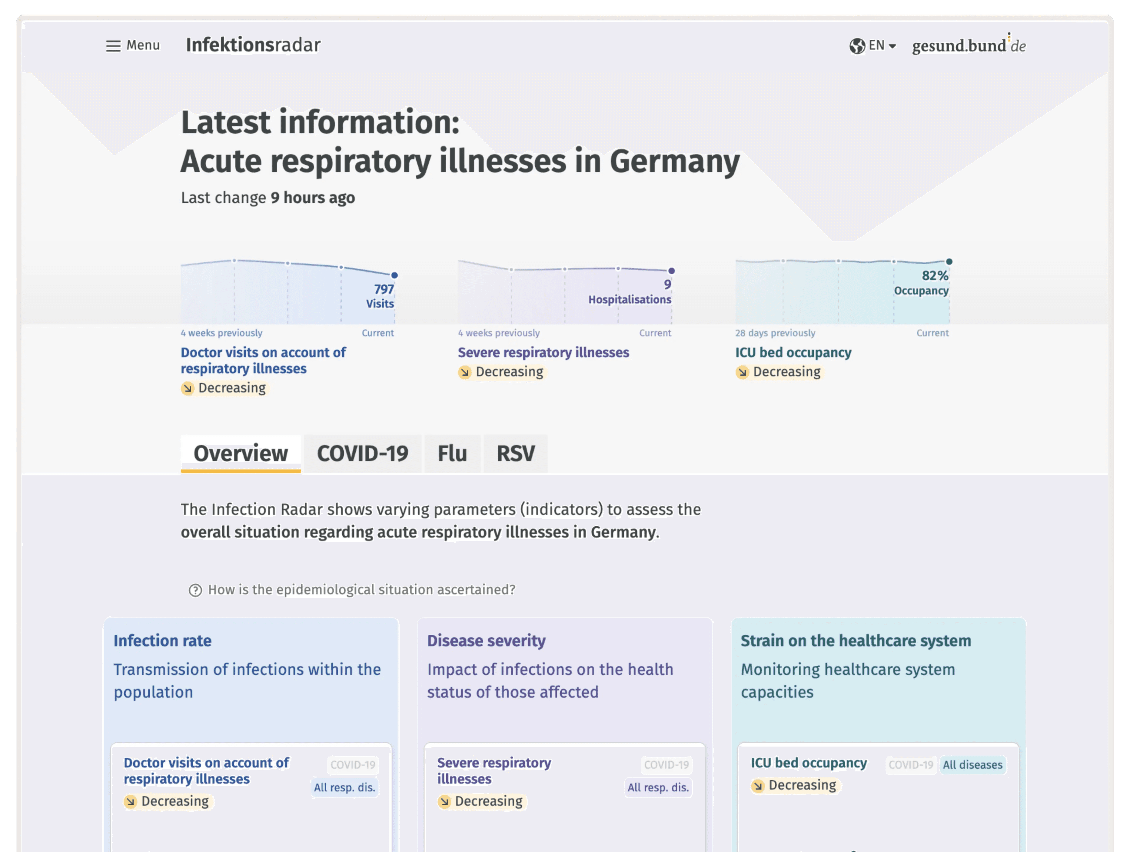
One of the most significant changes was a complete redesign of the landing page. The key challenge was to present three diseases, each with up to nine health indicators, in a way that remained clear and approachable. Therefore, our proposed solutions looked the following:

  1. Landing page providing an overview of the current infection situation throughout Germany. Users can see the complete overview at a glance and delve deeper with one click (see image above).

  2. Navigation between diseases and indicators is supported by a structured layout, precise copy, and intuitive interactions. All navigation patterns were rigorously user-tested to minimise confusion and enable efficient access to specific information (see image below).

  3. Reframing the product from desktop-first to mobile-first based on user insights (see image below).

The data dashboard is a major step forward in public health communication, addressing the need for accessible, comprehensive information and supporting transparent, data-driven governance.

year

2024

year

2024

year

2024

year

2024

timeframe

4 months

timeframe

4 months

timeframe

4 months

timeframe

4 months

Client

Ministry of Health

Client

Ministry of Health

Client

Ministry of Health

Client

Ministry of Health

category

Product Design

category

Product Design

category

Product Design

category

Product Design

01

(2) The health indicator cards serve both as navigation elements and quick status summaries, allowing users to grasp the current situation at a glance.

02

The health indicator detail page opens with a clear time chart and concise explanatory text, helping users quickly understand trends over time and draw informed conclusions for their own behaviour.

03

As they scroll, a map provides insight into the local situation, followed by a bar chart showing affected individuals by age group.

04

(3) Insights from analytics and user interviews showed that users like to check this kind of information in transitional moments—similar to consuming news on the go. This insight led to a clear design decision: mobile-first.

© 2026 Jil Zepp

© 2026 Jil Zepp

© 2026 Jil Zepp

© 2026 Jil Zepp

Create a free website with Framer, the website builder loved by startups, designers and agencies.